Le Mont Sauvage

- Client
- Habitat Pure Vie
- Location
- Laurentians, Quebec
- Year
- 2025
- Context
- With GENCO
- My role
- Creative Director
- Identity
- Le Mont Sauvage logoThree identities: Boréa, Auréal, SōmaPalettes, materials and guidelines
- Rollout
- Illustrated map of the estateSignage and welcome objectsStationery and printSales boardsWebsite
First the sign of a mountain, then three identities to help the estate grow.
The context
In the Laurentians, near Sainte-Adèle, Le Mont Sauvage is an estate in the heart of nature: land, homes, a community. To relaunch the project in 2025, it needed a more modern identity, one that could speak of the mountain and of the life people come there to live.
The sign
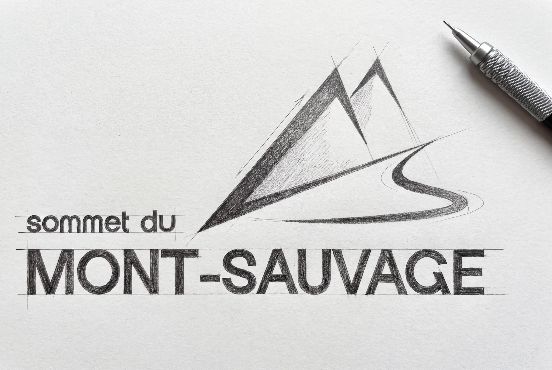
I explored five directions, from the mountain-resort crest to a purely typographic logo. The chosen monogram fuses the M and the S into a single gesture: the M draws the mountain’s two slopes, the S a trail, a river or the wind. A pared-back sign that works as well on a storefront sign as on a screen or a garment.
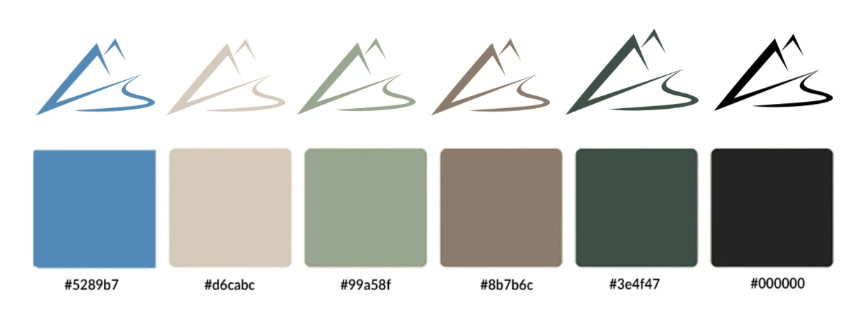
| Logo colour | Best media | Recommended backgrounds |
|---|---|---|
| Black and white | Digital, print, textile | White, light grey, beige, black |
| Deep green | Outdoors, brand image, wood | Light beige, natural wood, off-white |
| Glacier blue | Winter, high-end, sport | Snow white, cool grey, light blue |
| Brown and beige | Packaging, eco-design, stationery | Kraft, taupe grey, off-white, sage green |
The map
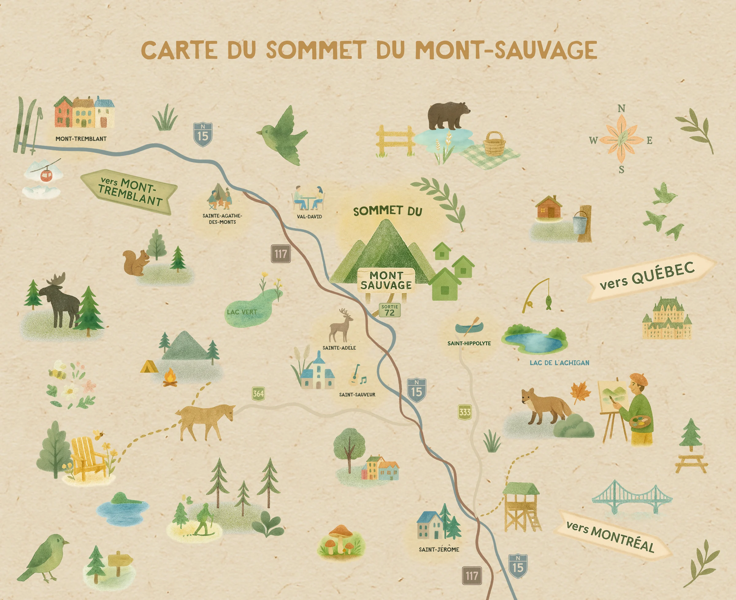
To place the estate, I hand-illustrated the map of its region: the villages, lakes, wildlife and outdoor life of the Laurentians, around Le Mont Sauvage.
Three houses, one family
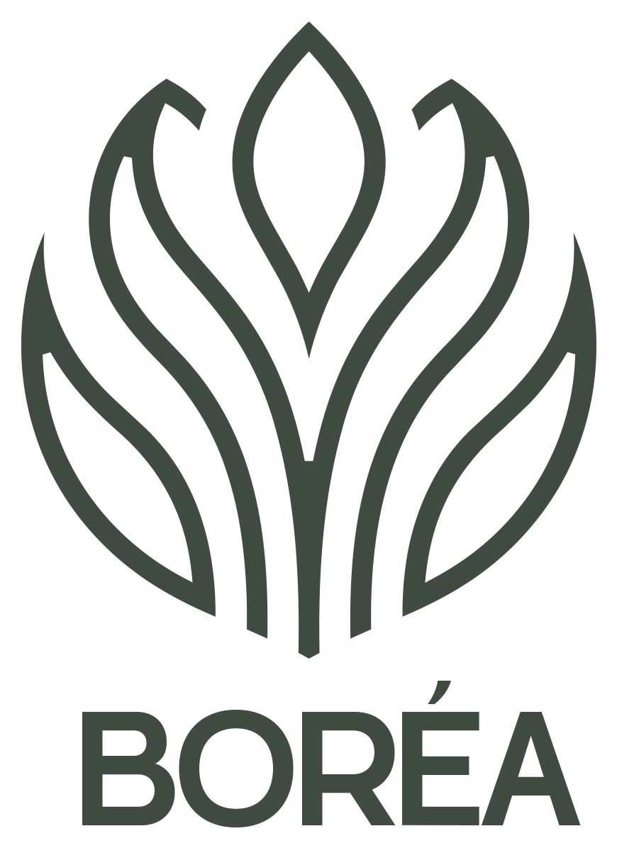
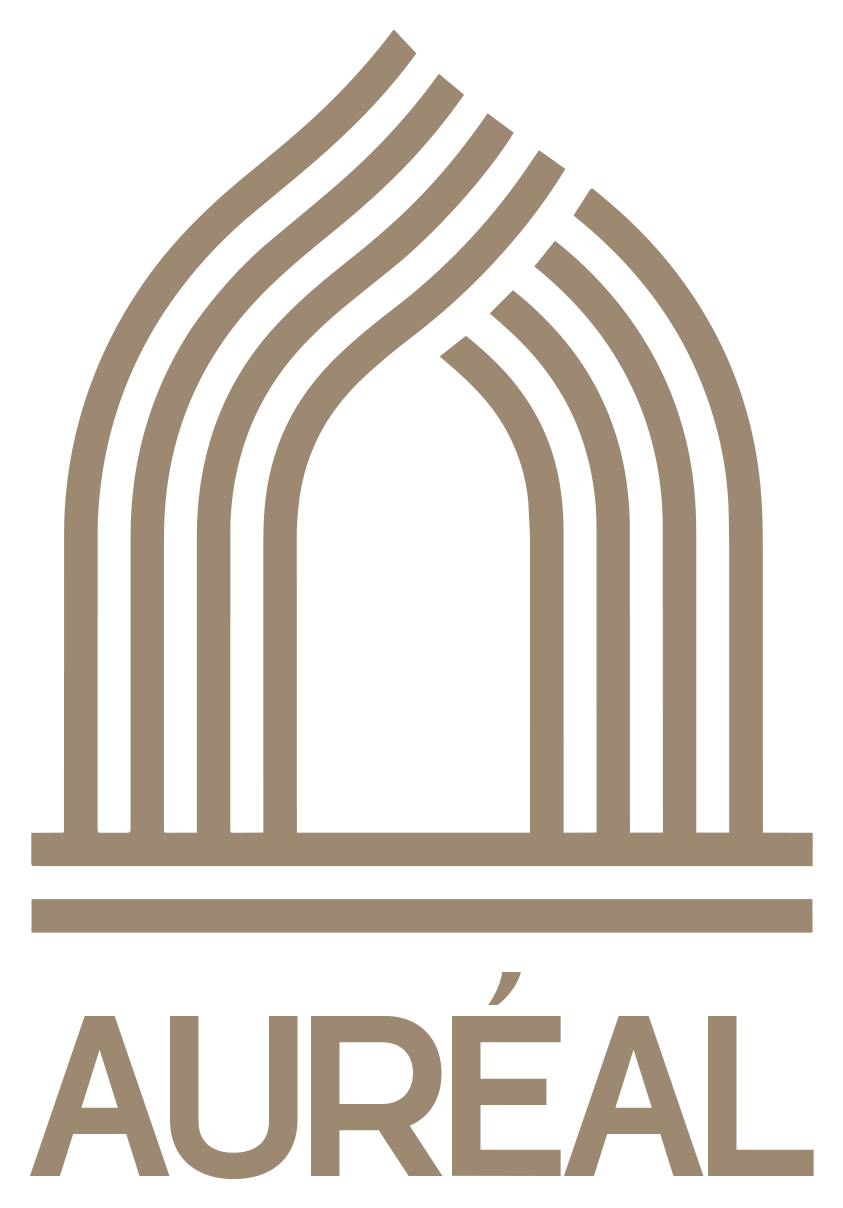
The estate then grew: a hotel, residences, a spa. Rather than a standalone logo for each, I set up a shared graphic language able to support Le Mont Sauvage’s growth over time. The three signs share the same grammar: a continuous line, a balanced construction, a subtle play of solid and void. Designed as signs rather than illustrations, they work as well in print as in architecture or on screen.
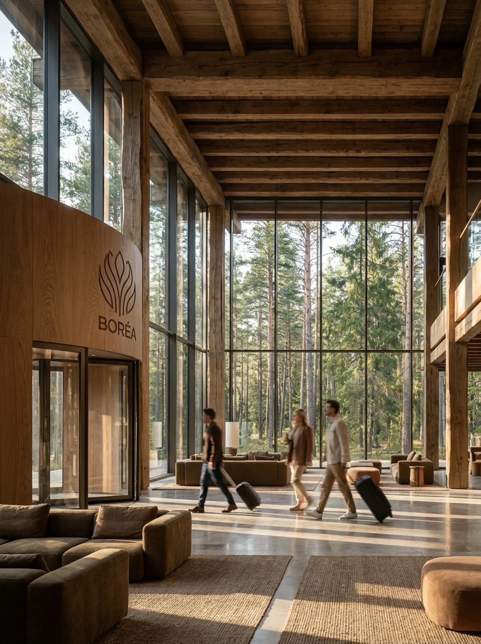
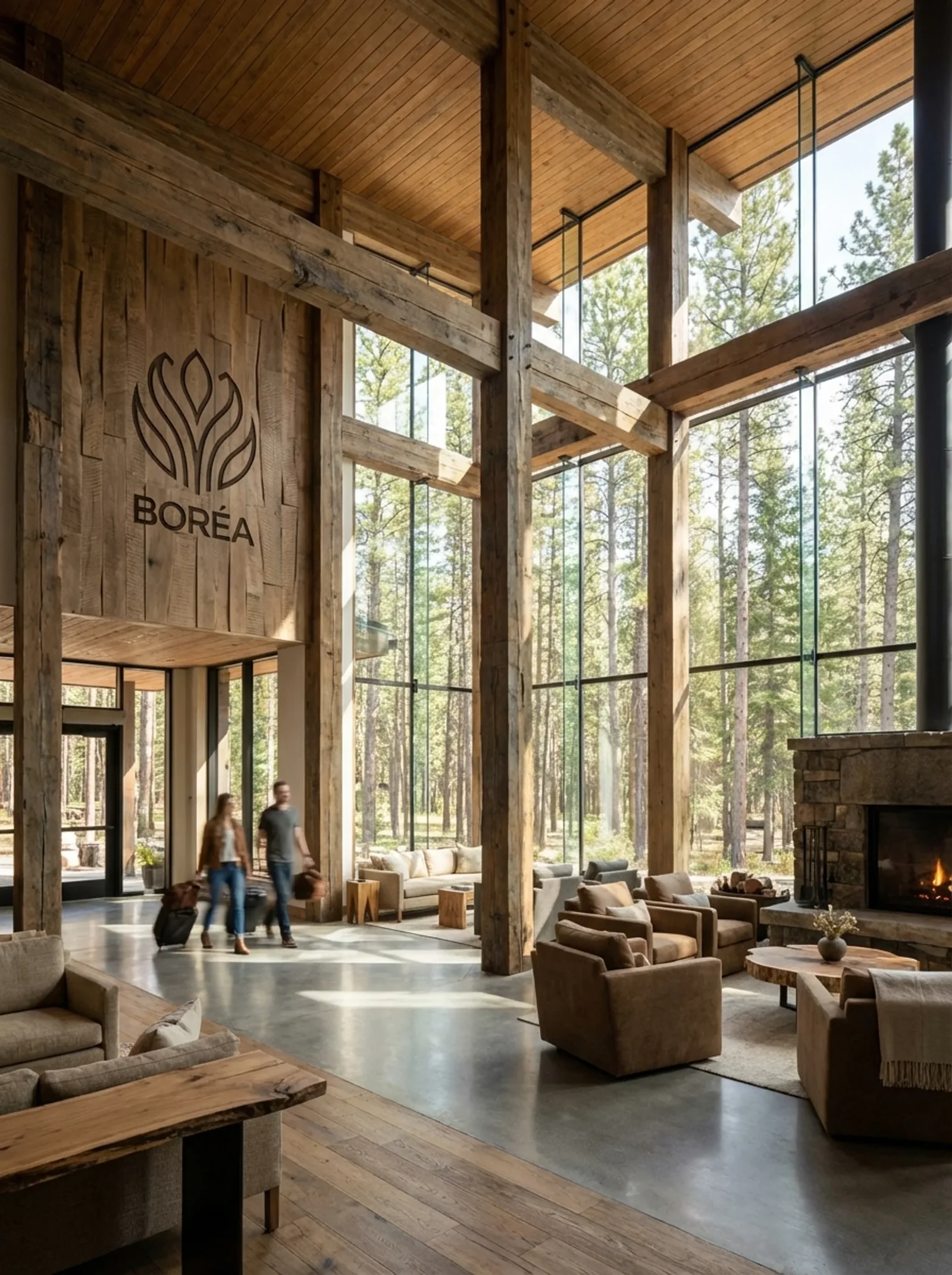
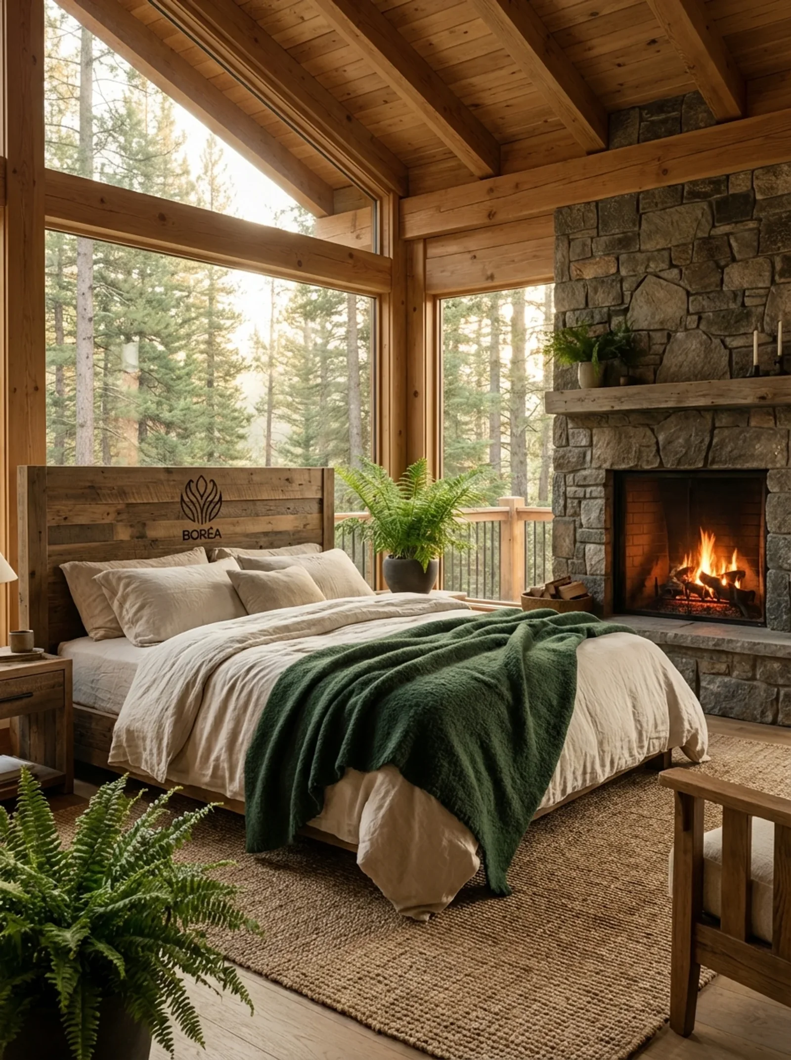
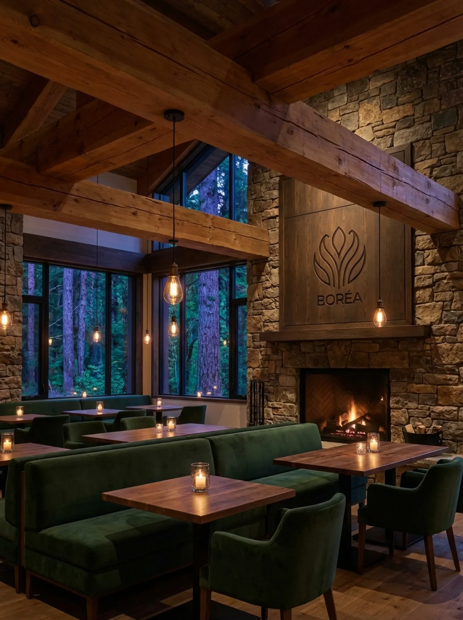
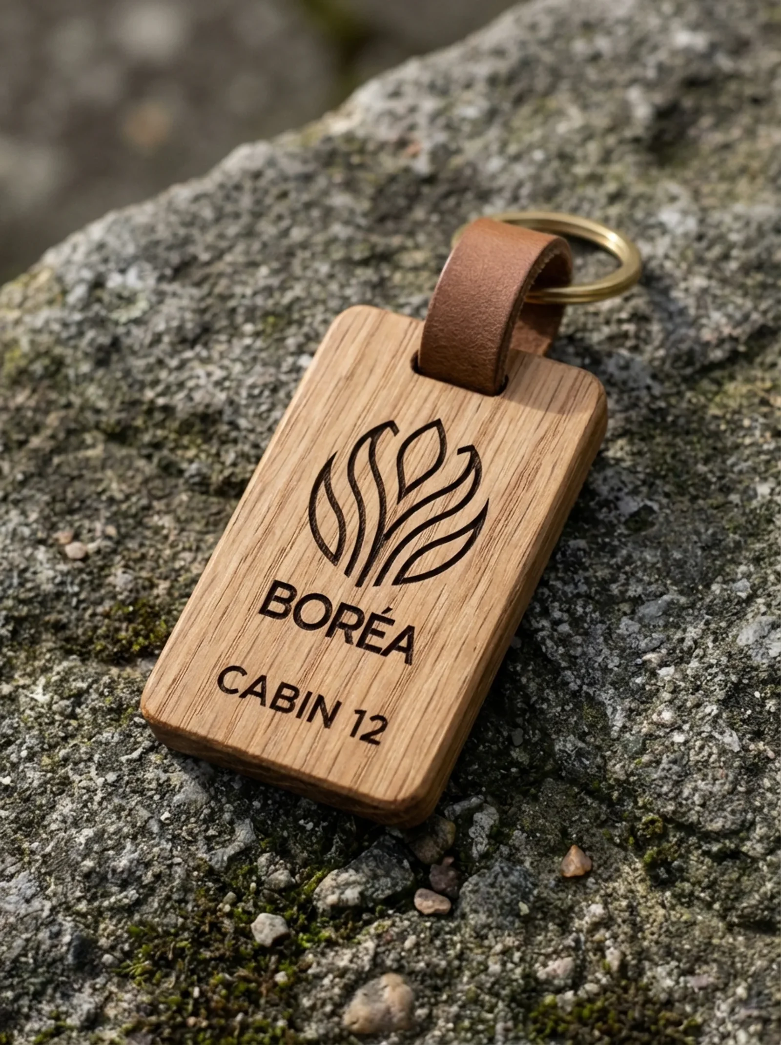
- Boréa, the hotel: the welcoming form. Openness, shelter, gentle protection.
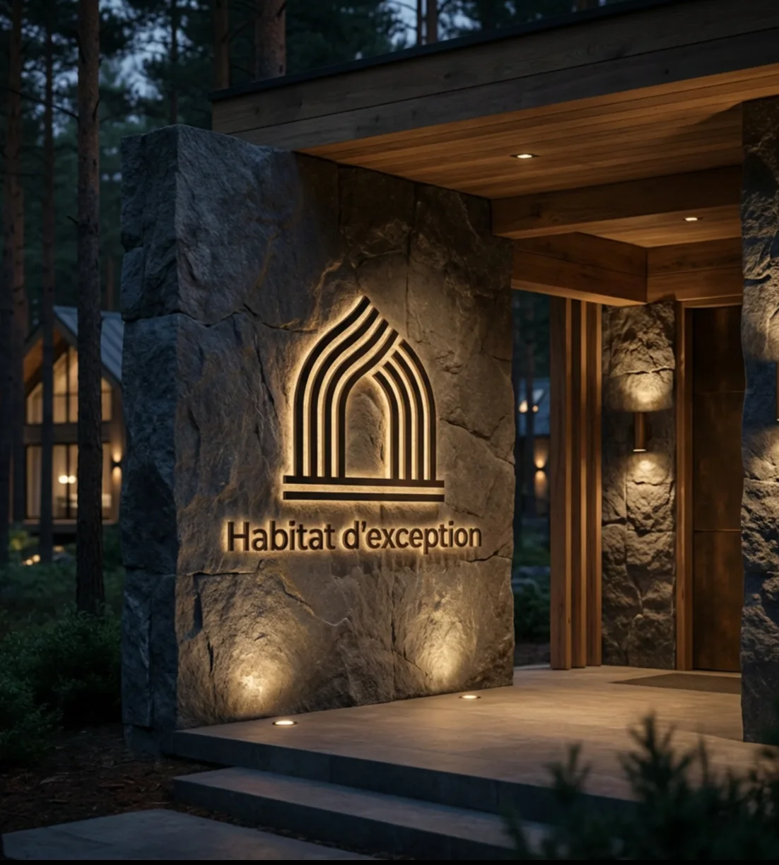
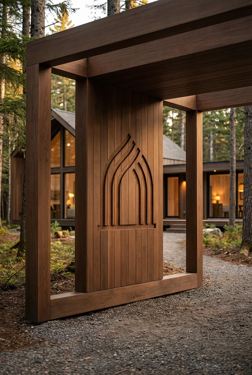
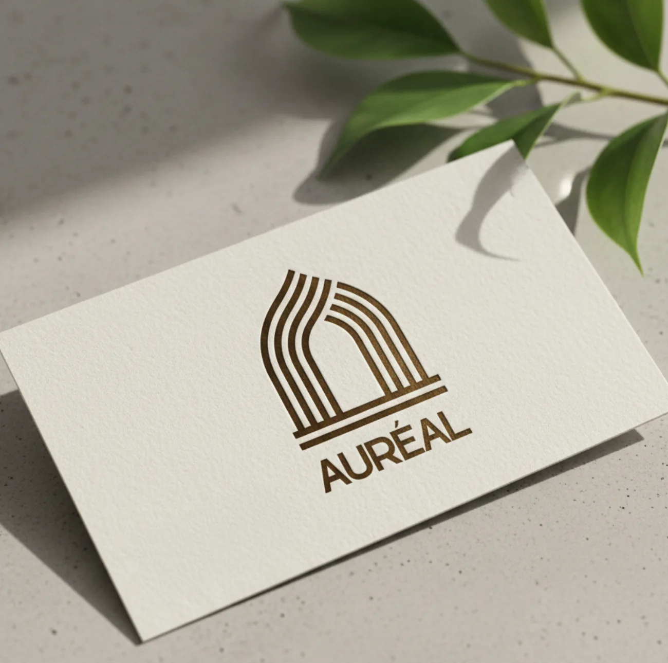
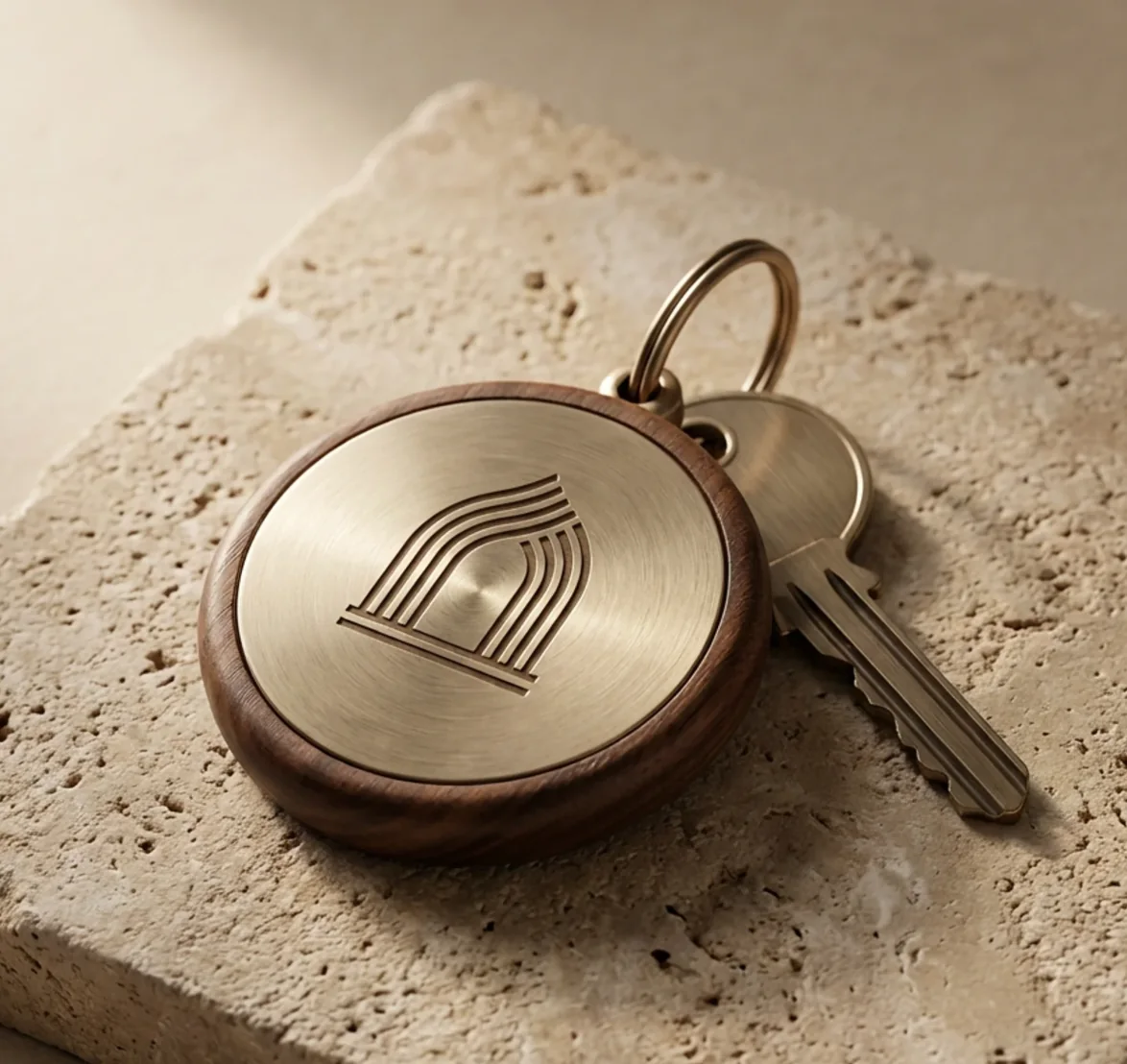
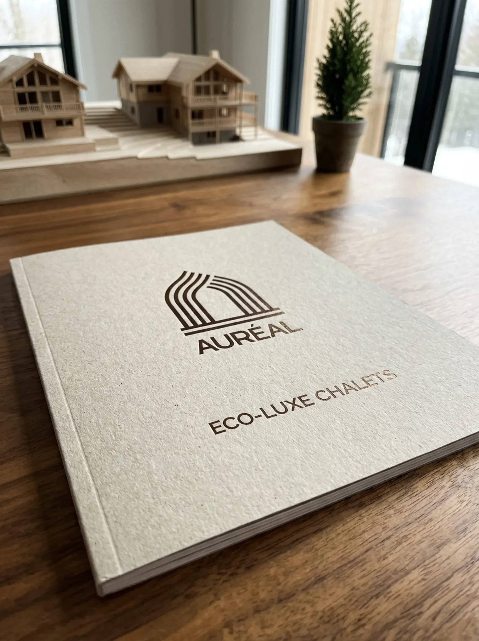
- Auréal, the residences: the inhabited form. Architecture, home, rootedness over time.
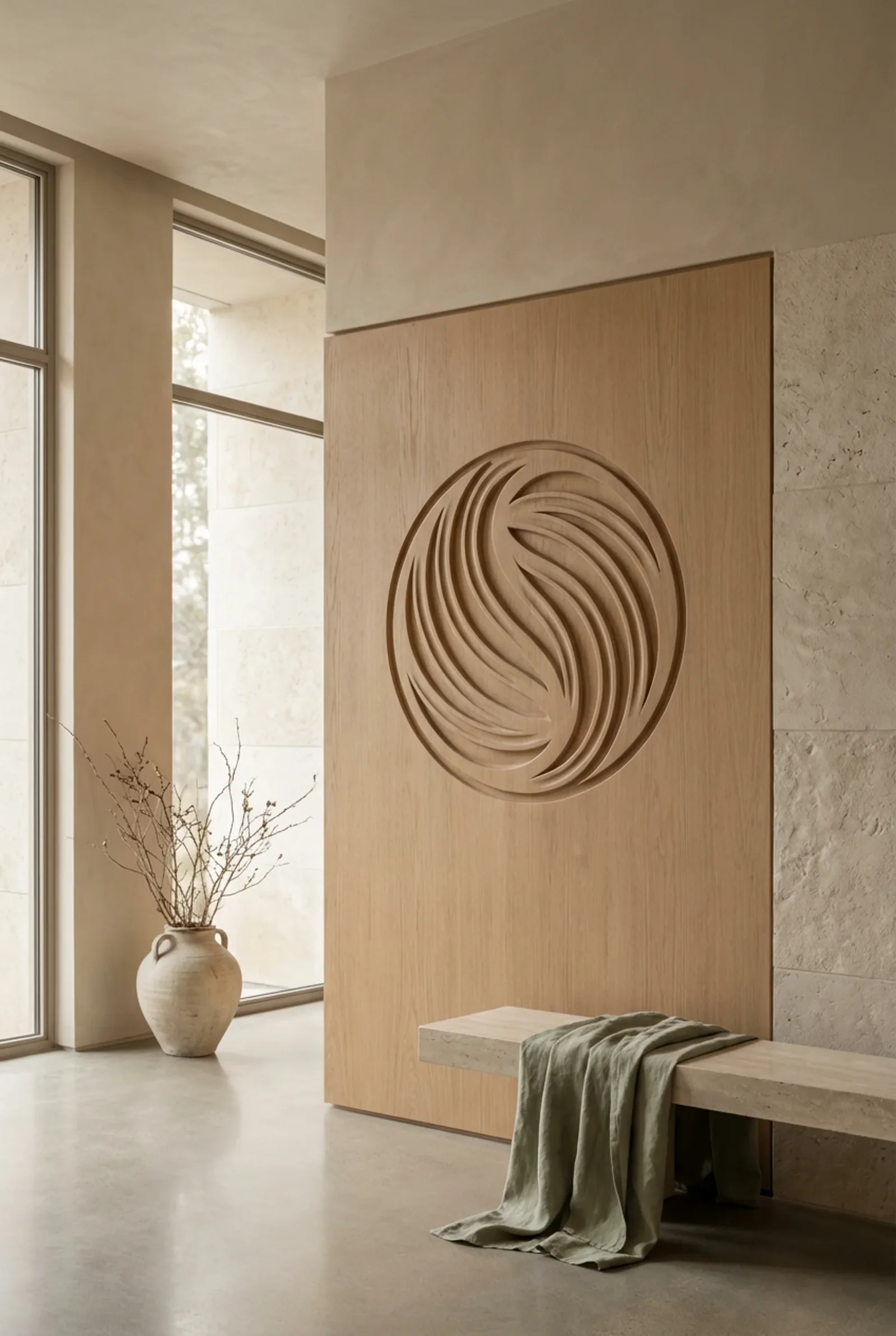
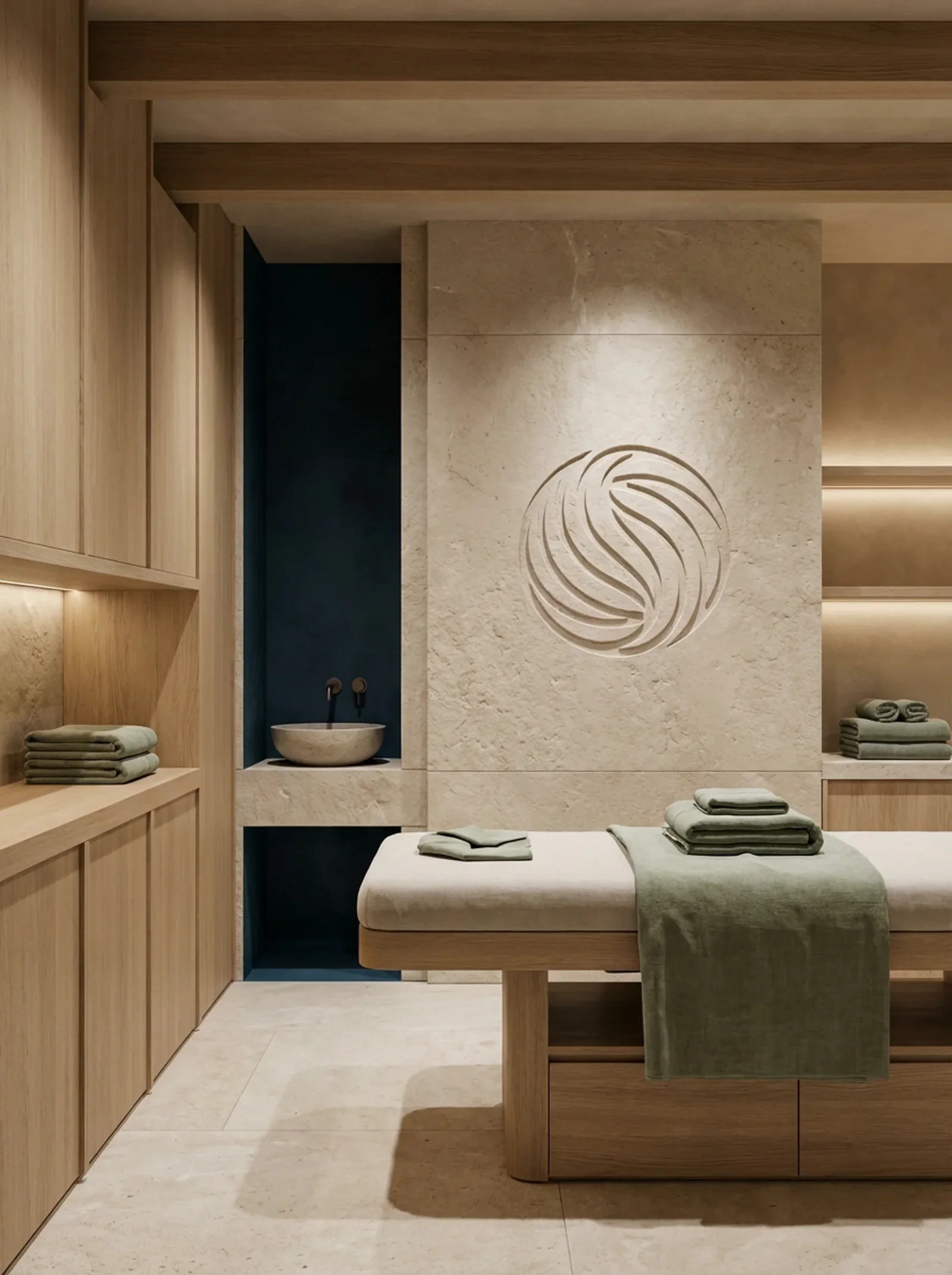
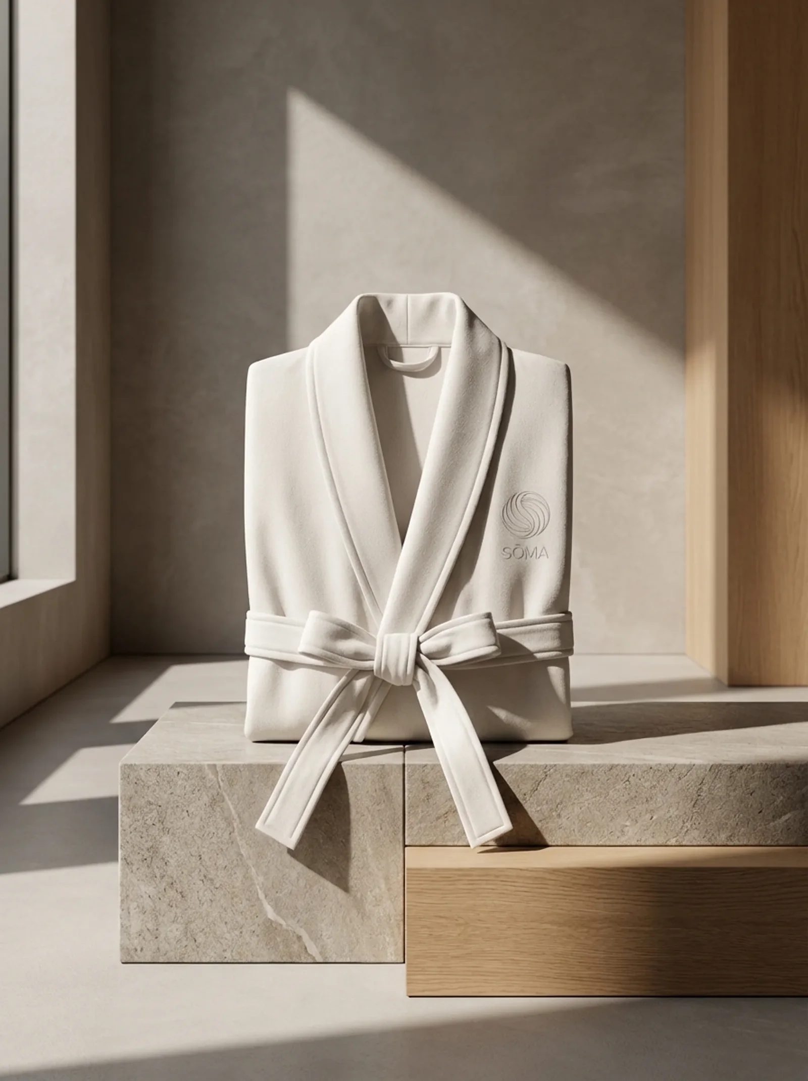
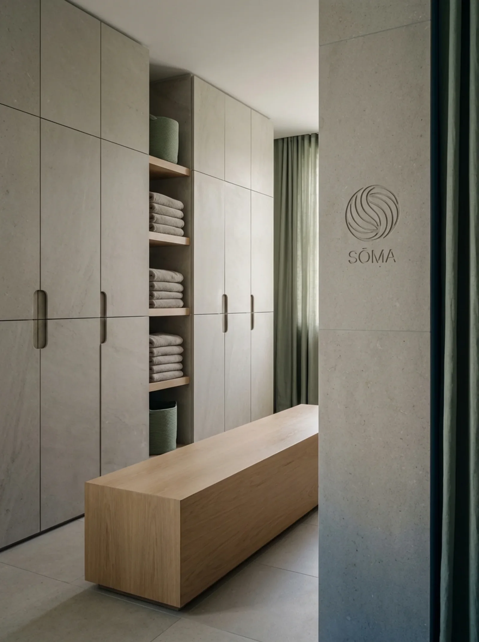
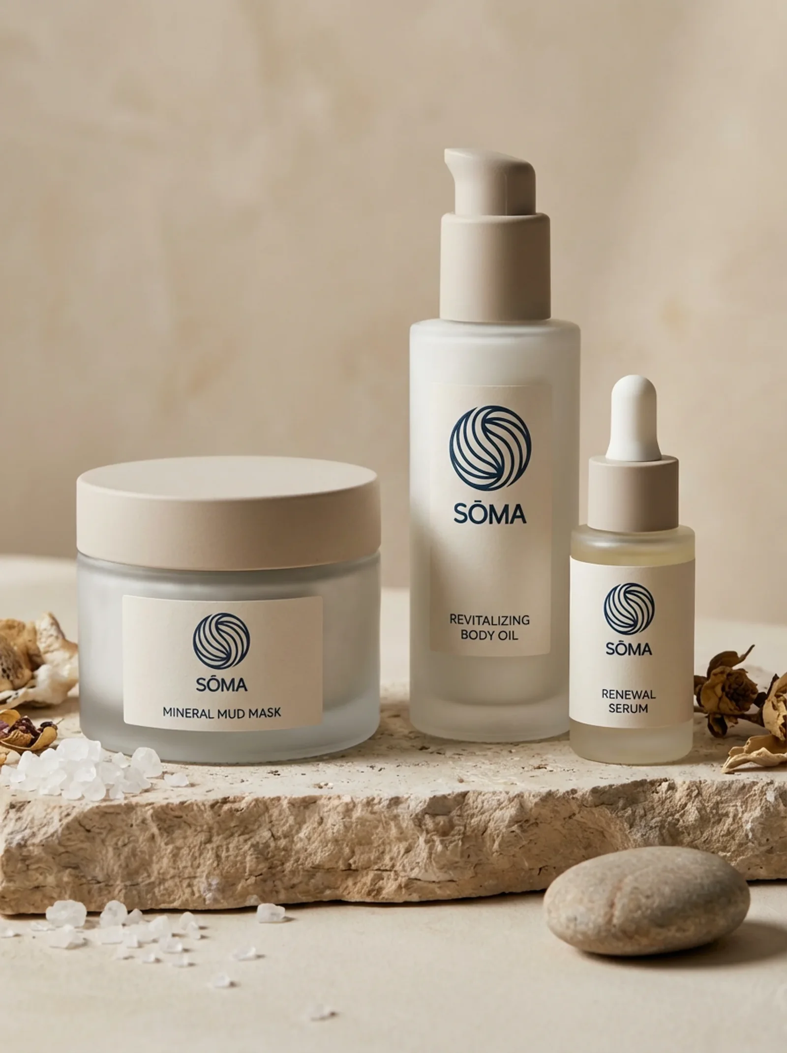
- Sōma, the spa: the form in motion. Flow, balance, the body’s energy.
The result
Boréa, the hotel
The nobility of the forest and mineral purity.
- Fir greenThe forest
- BarkThe texture of time
- WoolThe refuge
- River stoneThe memory of water
Auréal, the residences
The dialogue between stone and wood.
- Mirror blackThe anchor
- Limestone beigeThe breath
- Warm oakThe imprint
- Mineral rock greyThe nuance
Sōma, the spa
An ode to clarity: emptiness, transparency, soothing materials.
- Spring blueThe vital element
- Sandy linenThe caress
- Sage greenBotanical clarity
- Pebble greyMineral serenity
The team
- Creative direction and design
- Nelly Tadjer
- In collaboration with
- GENCO