GENCO


- Client
- GENCO, Génération CO.llective
- Location
- Montreal and Paris
- Year
- 2026
- My role
- Creative direction
- Identity
- Diagnosis and visionThree directions, one recommendationLogotype and compact signature
- System
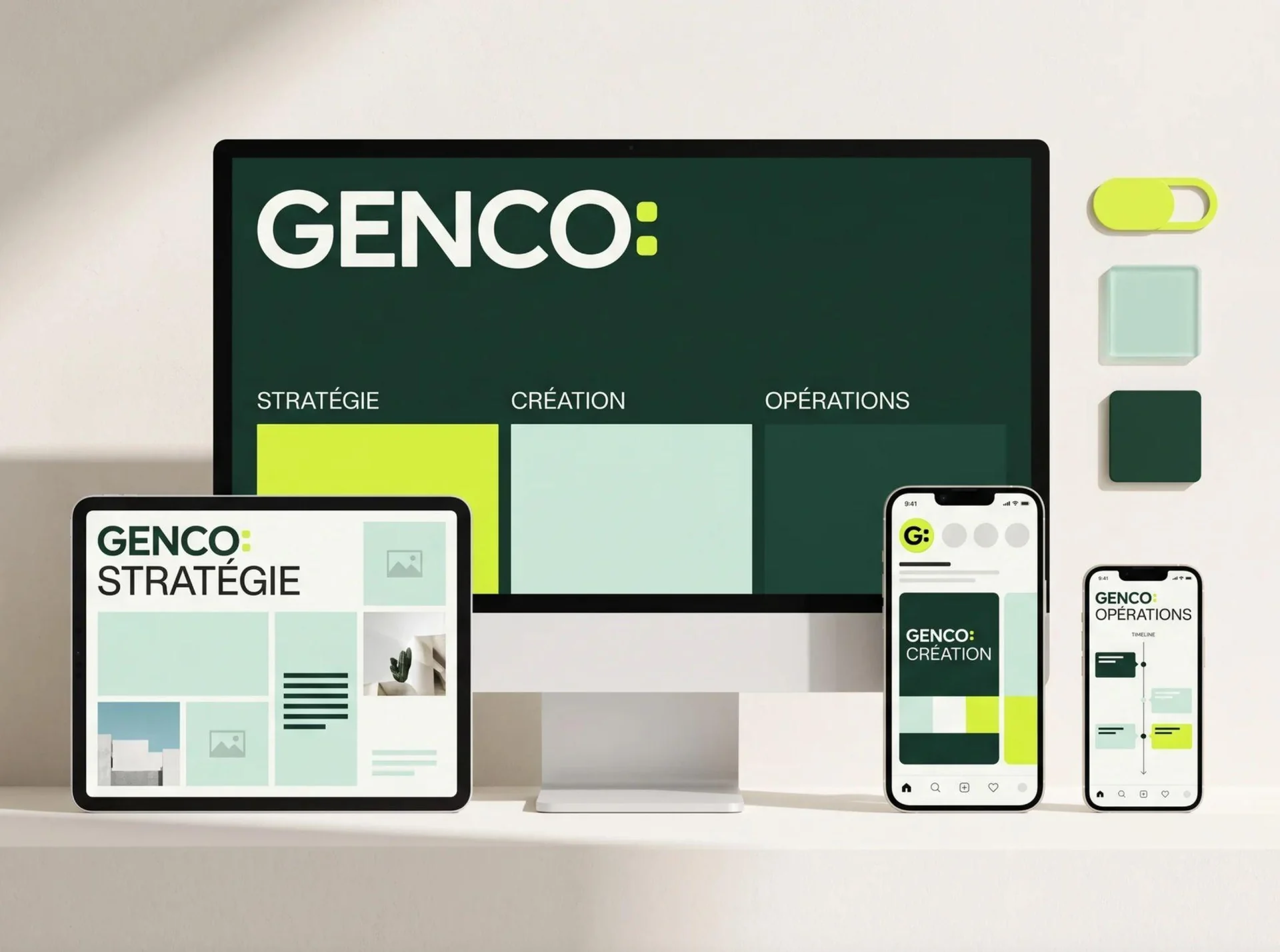
- Activated expertiseSignage and stationeryWebsite and social media
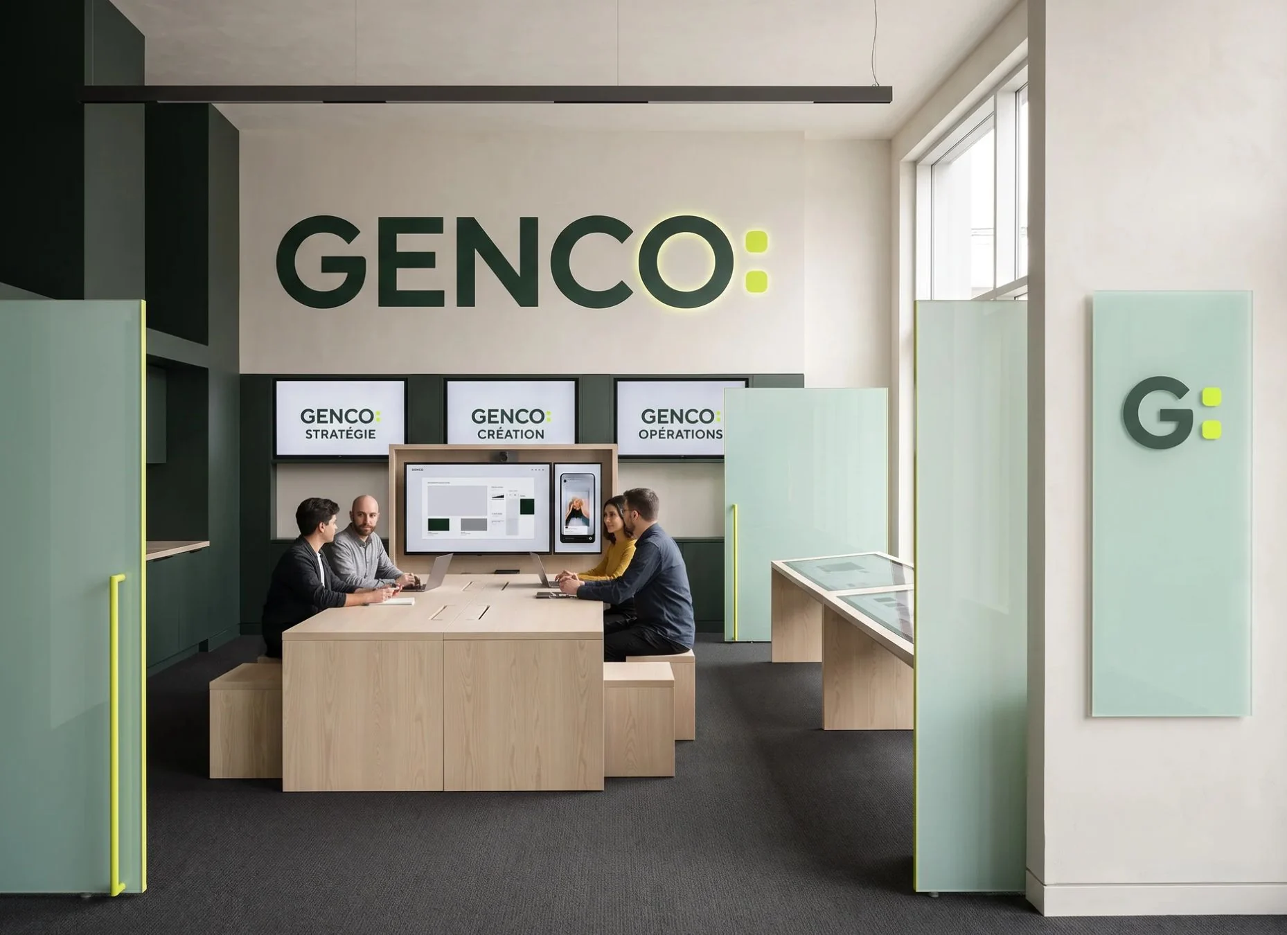
GENCO: is not a brand that ends. It is a brand that activates what comes next.
The context
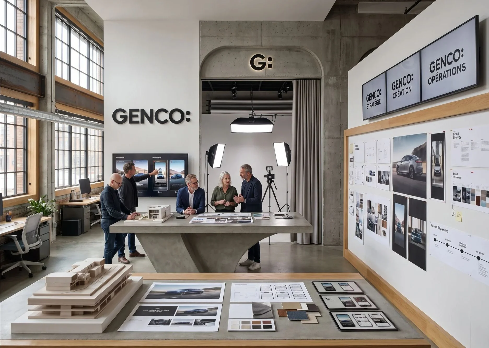
GENCO brings together strategic, creative and operational expertise, and embeds it directly in its clients’ teams. Its identity had been designed quickly, at a time when it simply needed to exist. It no longer reflected the level of support it provides, nor the ambition of growing from Montreal to Paris.
My diagnosis: the right intuition, a provisional execution. A hexagon that belongs to the vocabulary of an entire category, a name locked inside its symbol, unreadable where it matters most.
The stance
A logo doesn’t have to tell the whole story. It has to be recognized. I presented three directions and recommended the one GENCO chose: the active extension.
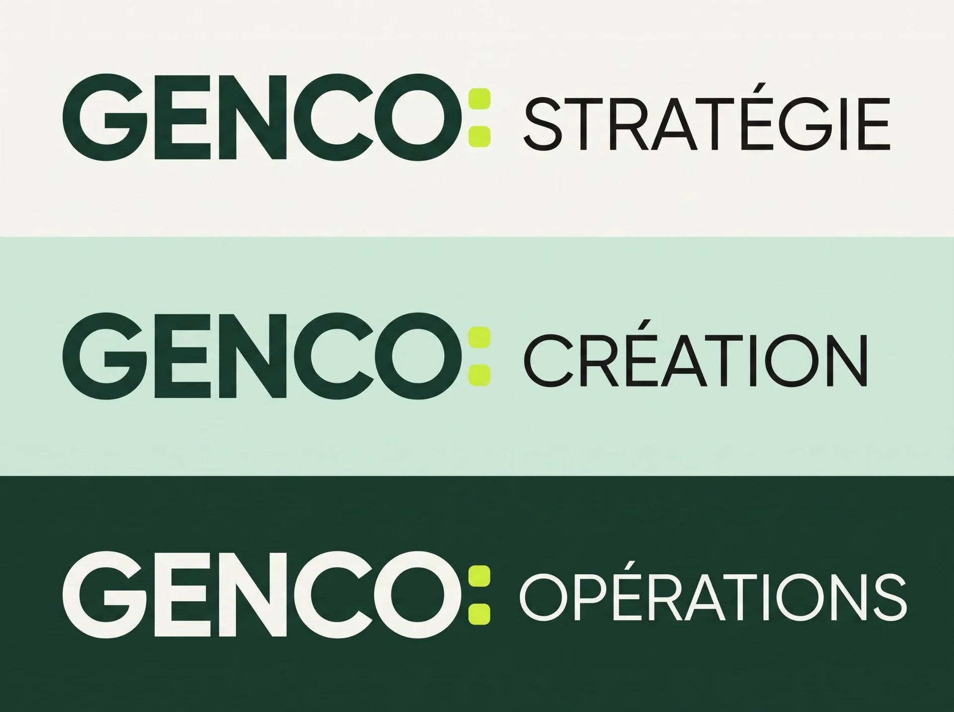
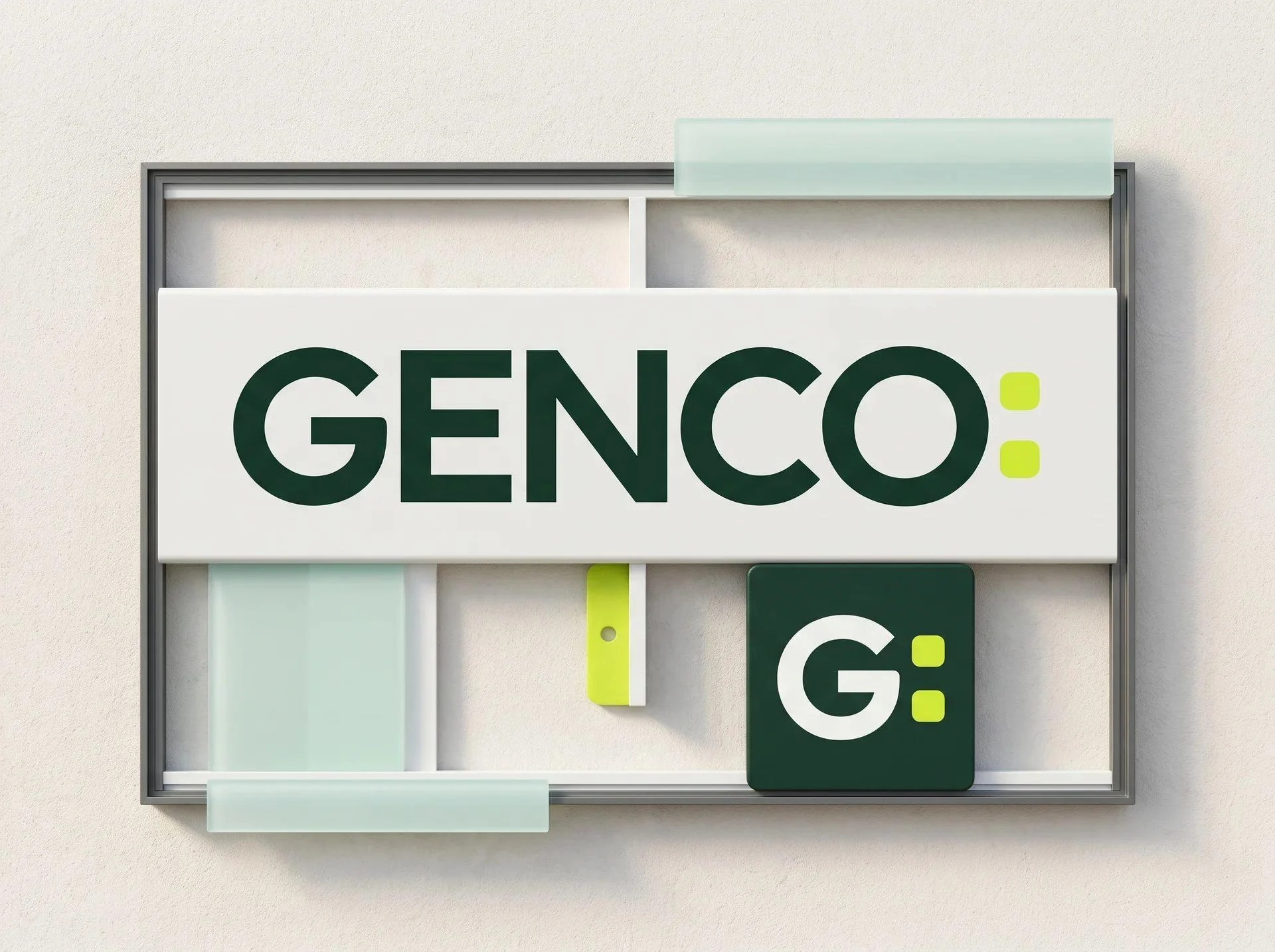
The colon announces what comes next. It links a subject to an action, just as GENCO extends its clients’ teams and activates the expertise they need. The name stays the constant marker; the word that follows changes with the context.
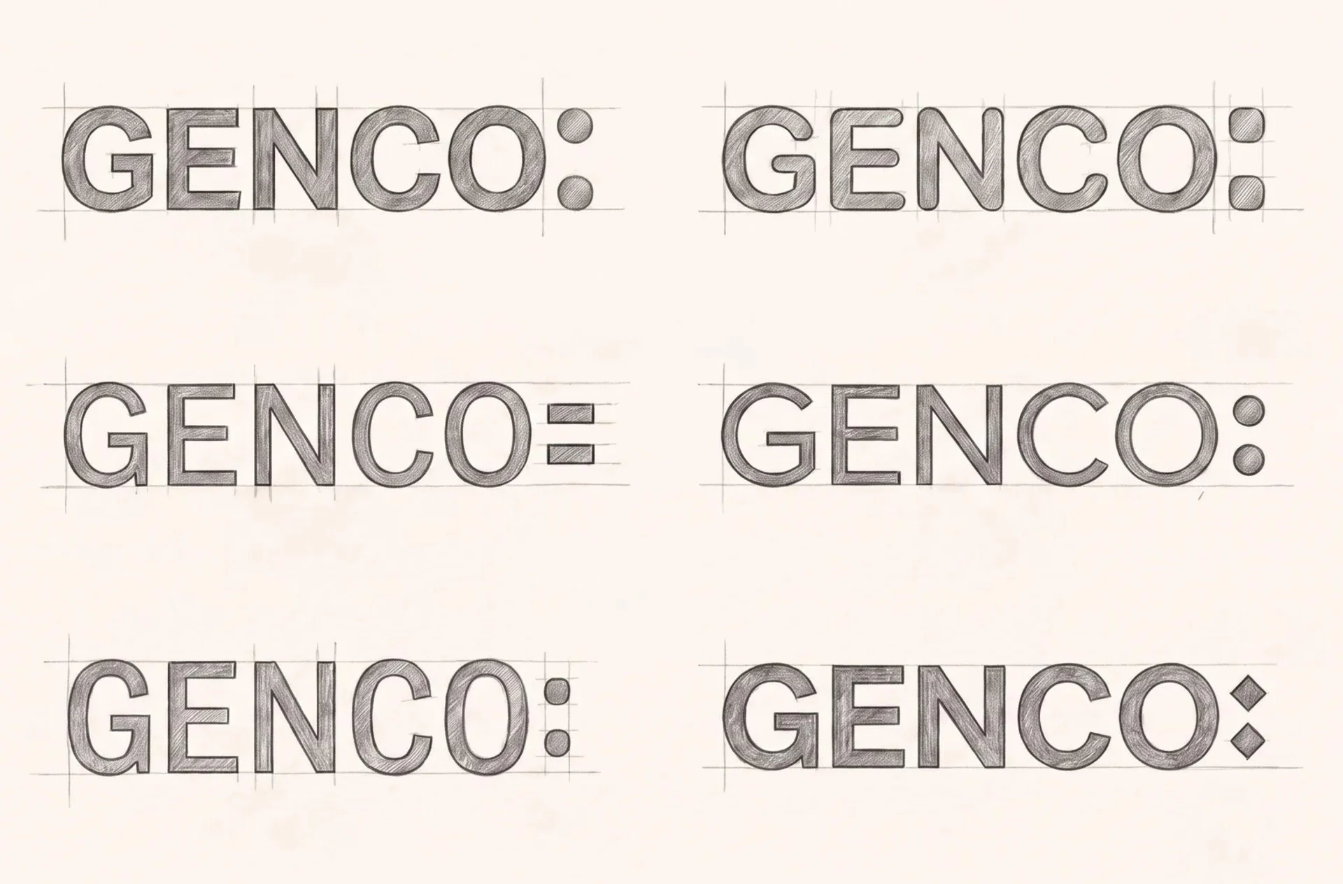
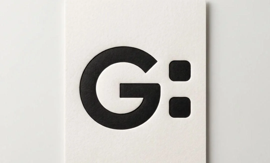
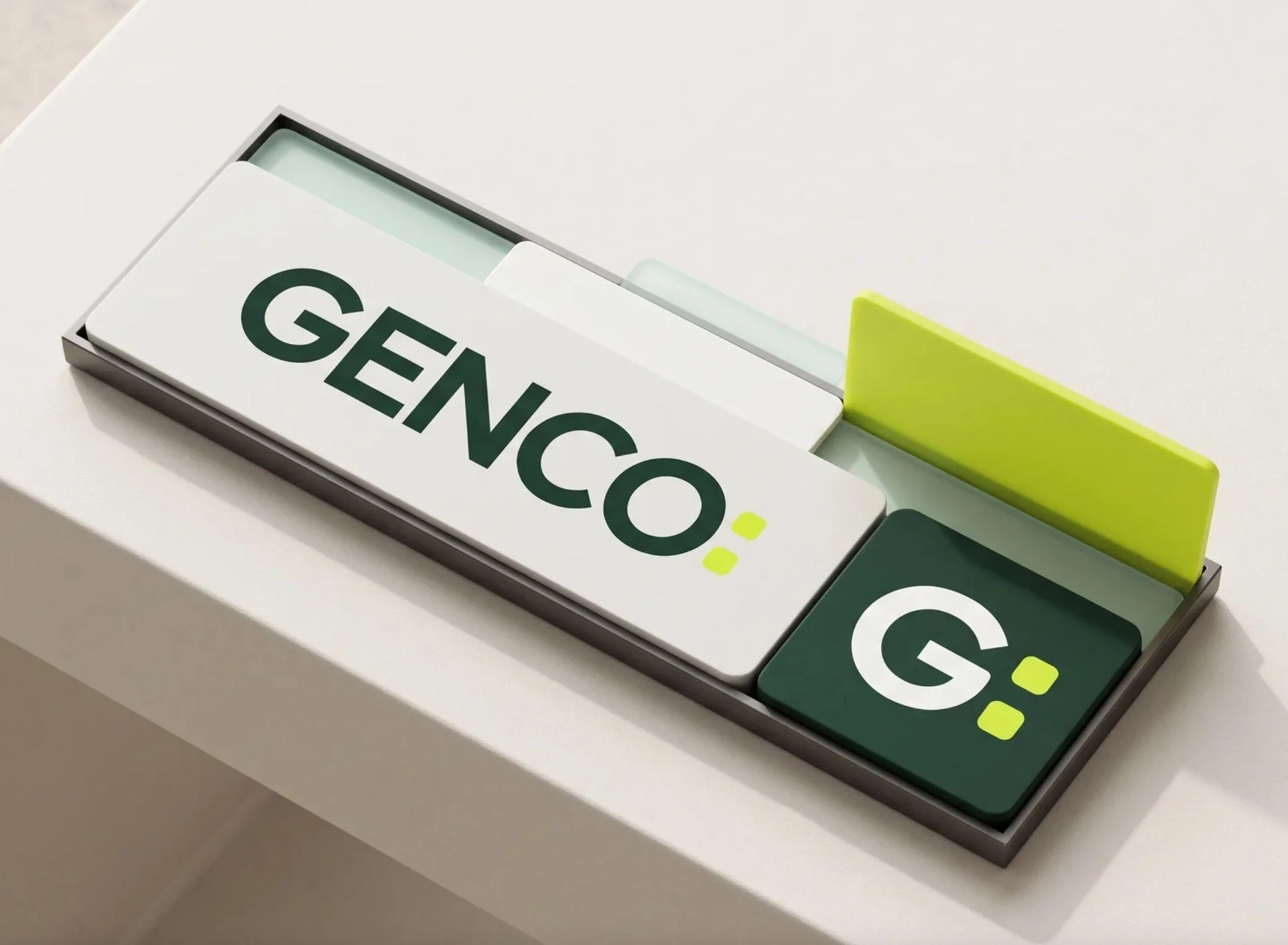
A colon drawn, not typed
Two identical modules on the same vertical axis. Their width matches the weight of the letters; their slightly softened corners give more stability than round dots, without looking mechanical. Generous spacing marks the pause between the name, which stays fixed, and what GENCO chooses to activate.
The punctuation doesn’t complete the name. It organizes the whole system.
The result
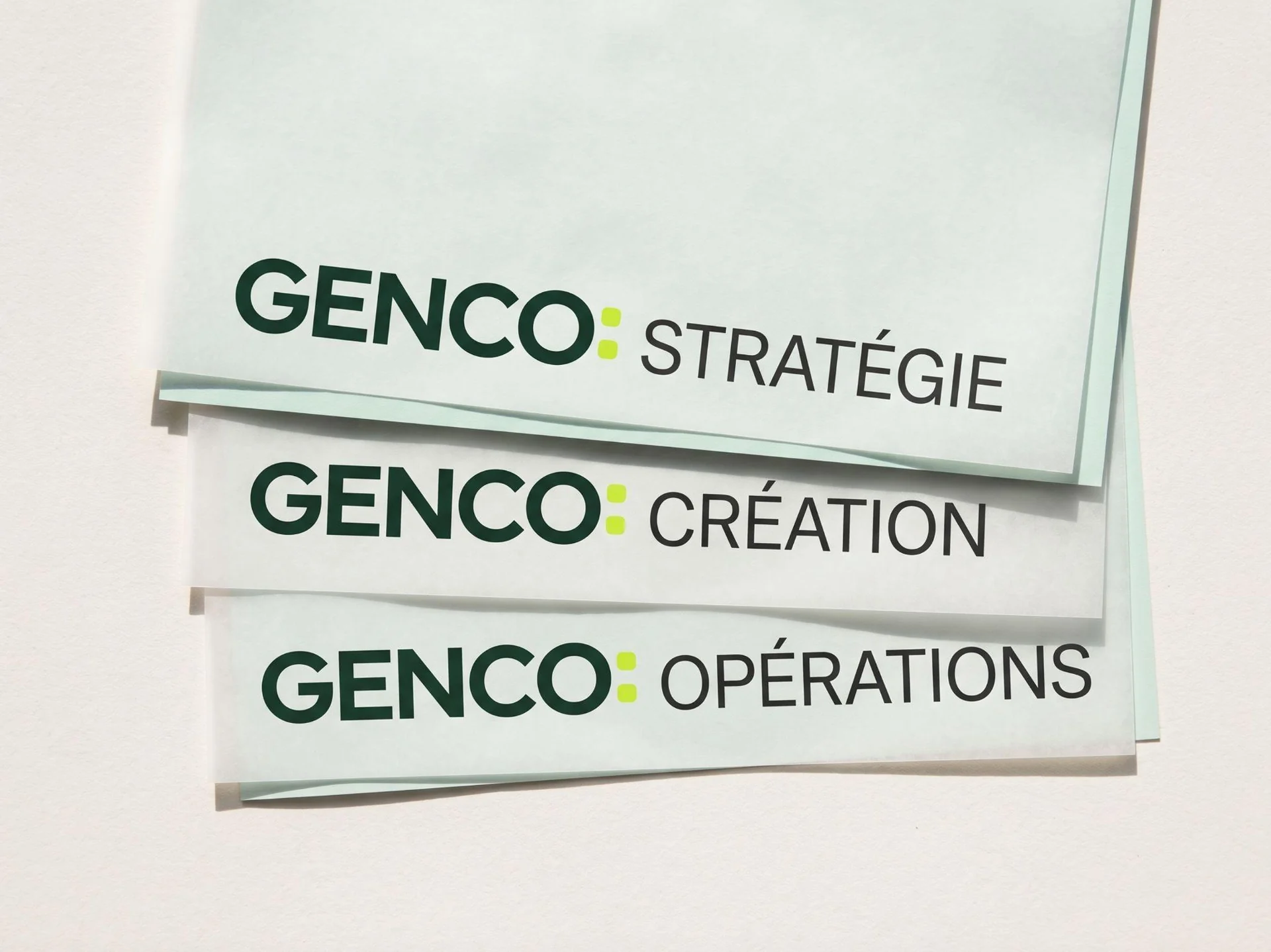
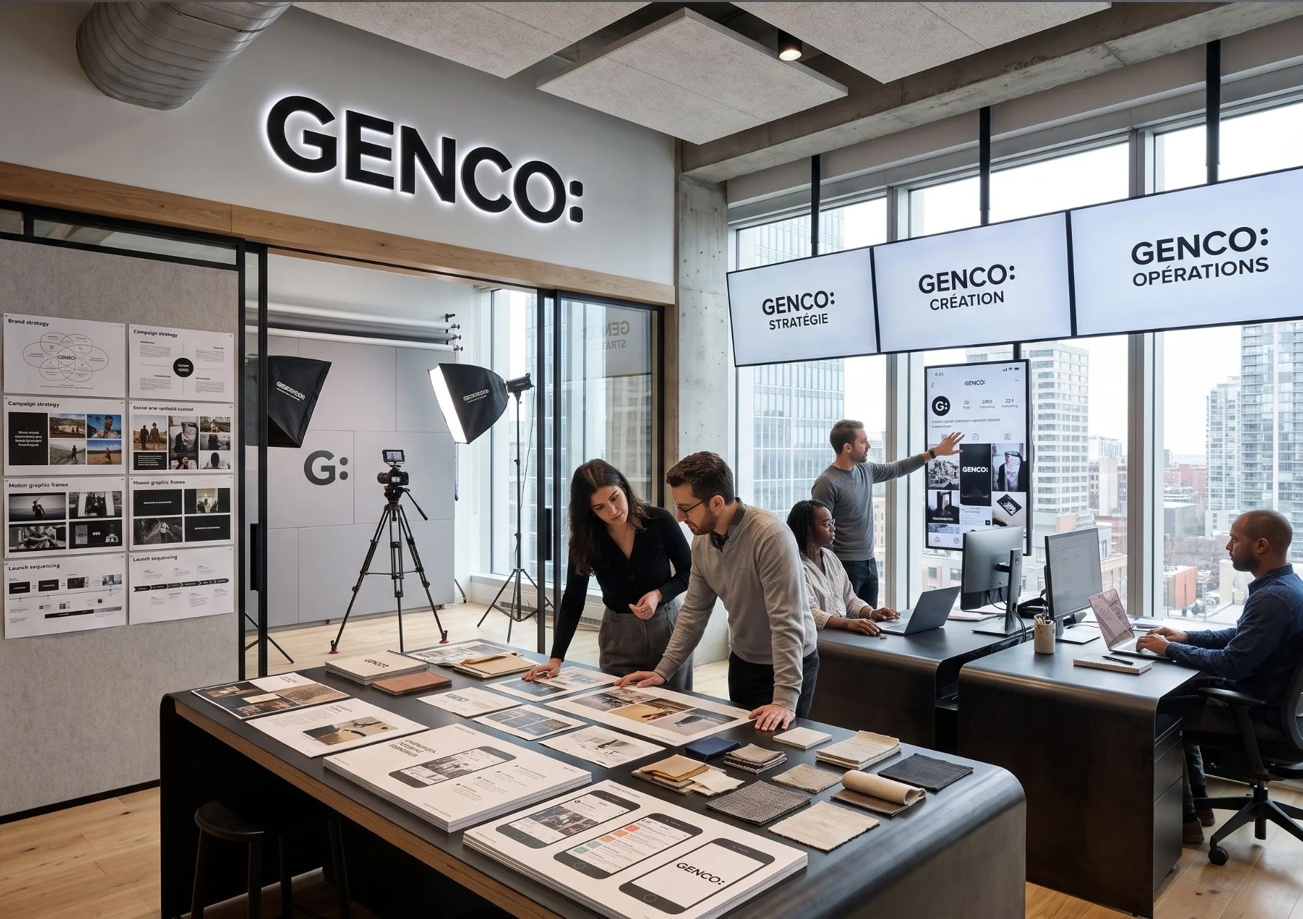
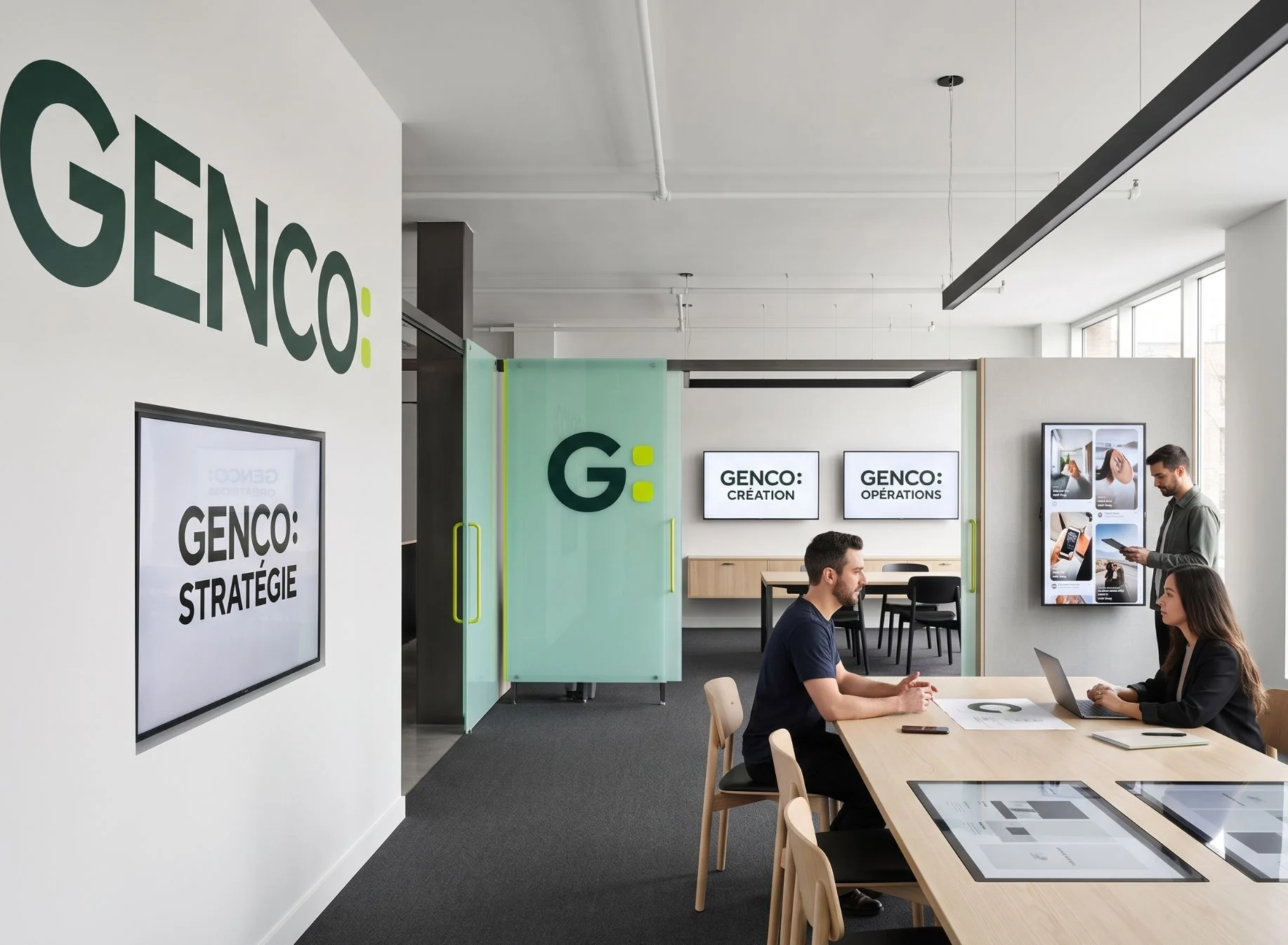
A fixed signature, activated expertise: a new area of expertise or a new territory enters the system without touching the logotype.
- Deep green#1B3B2F
- Water green#CDE6D8
- Acid green#CAED38
- Off-white#F4F3EB
The team
- Creative direction and design
- Nelly Tadjer