Immo Alliances
- Client
- Groupe Immo Alliances
- Year
- 2026
- Context
- With GENCO
- My role
- Creative Director
- Strategy
- Brand platformArchitecture of the group and its entities
- Identity
- Monogram and logo familyEntity palette, typographyBrand standards guide
- Rollout
- SignageStationery, foil-stamped business cardsSite workwearTrade show booth, façade bannerVehicle letteringFilms for tenders
- Over time
- Website compliance follow-upIdentity consistency with partners across the Atlantic
How one sign brings several real estate businesses together.
The context
A Quebec real estate group on the rise, Immo Alliances needed an identity equal to that trajectory: one that could make the complementarity of its branches readable, and carry its partnerships across the Atlantic. Starting point: the manifesto reworked by the team, and the conversations that shaped my thinking.
The stance
Translate that ambition into a shared visual system, carried by one idea: The Revealing Angle. No longer decorating, but revealing the structure, the framework of the expertise. The monogram stands on three pillars:
- The Foundation: the vertical base, the group’s steady footing.
- The Growth: the rising diagonal, deliberately taller, which sets things in motion.
- The Alliance: the crossing pillar, the keystone linking the entities and their partners.


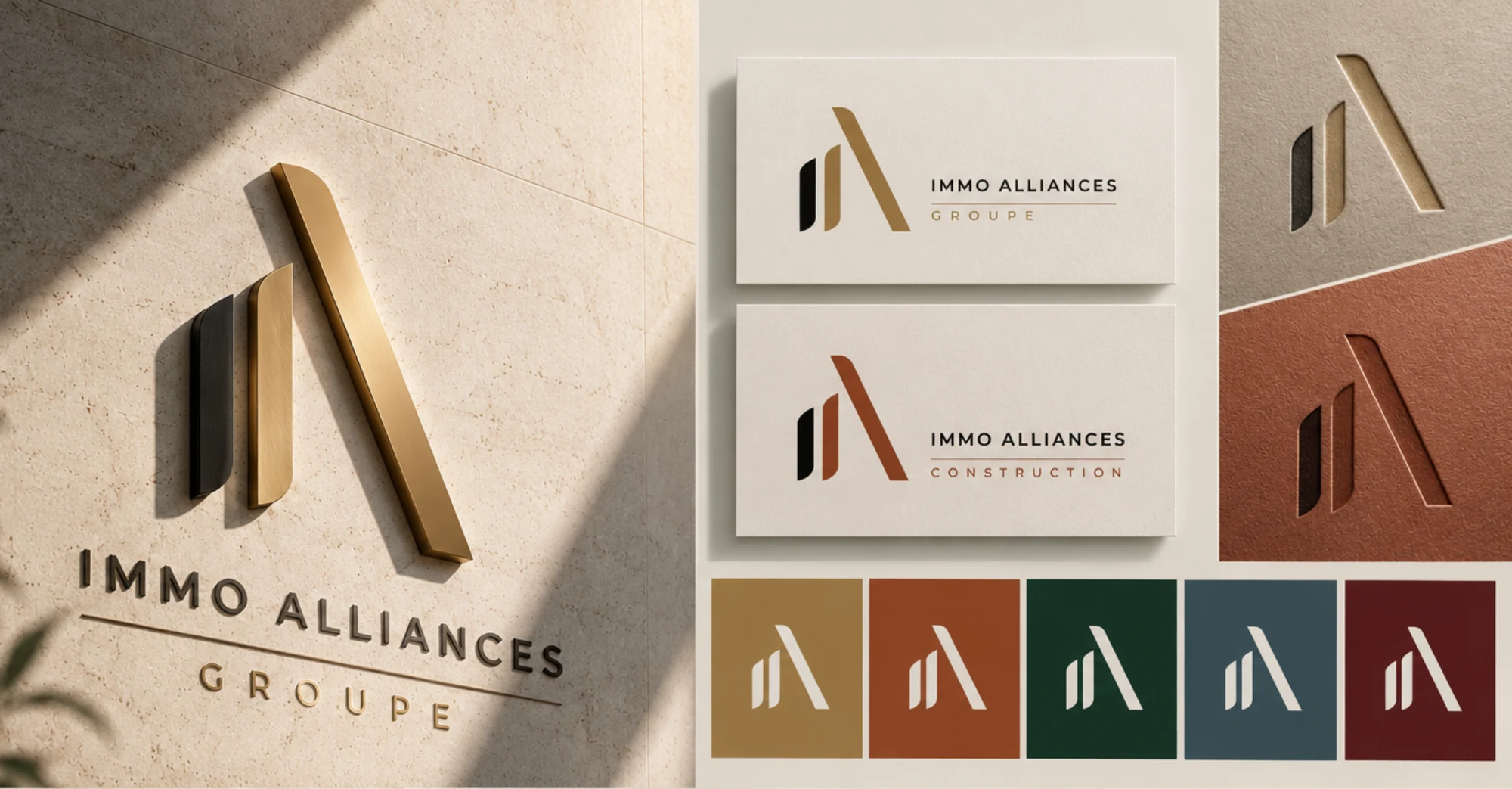
The sign never changes. Only the colour of the rising pillar, the line and the name identifies each entity.
- GroupBrass gold
- ConstructionTerracotta
- CapitalForest green
- ManagementPetrol slate
- CollectiveVineyard
The result
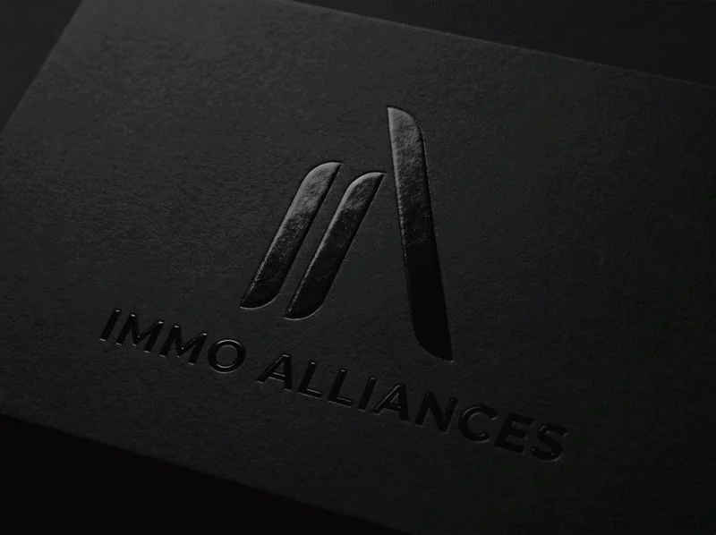
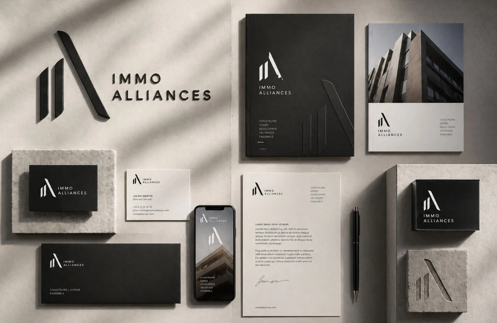
One sign for five entities, and a family of logos rolled out across every touchpoint of the group: signage, stationery, site workwear, trade show booth, façade banners, website and vehicle lettering.


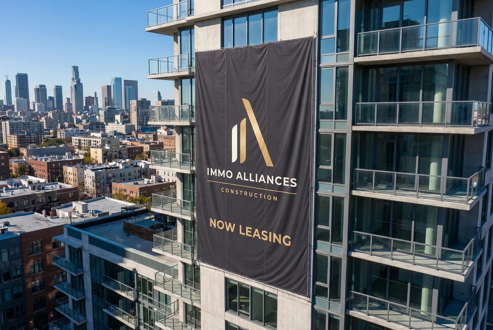


On site



For tenders
To answer the group’s tenders, I made transformation films, including the one that opens this page: buildings and interiors that come apart, then rebuild themselves before the client’s eyes.
The team
- Creative direction, strategy and design
- Nelly Tadjer
- Manifesto
- The Immo Alliances team